How I accidentally taught white supremacy in a feminism session

Well. I’ve just found out I accidentally helped ingrain some white supremacy last week. As someone who’s really passionate about social justice causes, that’s kind of hard to swallow.

I came across an article today, by the Equity in Education Coalition, arguing that a well known picture explaining the difference between Equality and Equity is actually a textbook example of White Supremacy at work.

Three people (one tall, one medium height, one short) stand on boxes along a fence. In the first half, they all have one box. The two tallest can see over the fence, the shortest cannot. In the second half, the tall person has no box, the medium height person has one box and the shortest person has two boxes. All three people can now see over the fence.

You think you’re teaching the difference between equality and equity, but no. You are actually teaching white supremacy.

The article argues that this image positions the people who might need more to succeed in a given environment, as the problem. The people are the underlying problem in the image. When of course, in reality the environment is the problem. I recommend you take a few minutes and read the whole article.

Last week, I was part of a panel in a session where we used that very image.

Through msRuptNow, Jen Love, Beth Ann Locke, Mimosa Kabir and I hosted a panel on feminism and fundraising at AFP Congress Toronto (a Fundraising conference). We highlighted this explanation, albeit with a third panel explaining how we need to get from equity to justice – by removing the barriers that makes equity measures necessary in the first place.

Three sections: 1st section, over the word «equality», has three people of different height standing on boxes, attempting to look over a fence. They all stand on a box, the two tallest can see over the fence, the shortest cannot. 2nd section, over the word «equity»: The tallest now has no box, the middle height person has one box and the shortest person has two boxes. All three can see over the fence. 3rd section, over the word «justice»: No persons have boxes. The fence is replaced by a see-through barrier. All three can see through the fence with no help.

What we thought we were teaching: Equality and Equity are yesterday’s solutions – it’s time to move on to Justice (removing the barriers to let everyone have an equal view.
📸Background football photo: flickr.com/itmn CC BY-NC-SA 2.0

Not for a second did occur to any of us that we were, in fact, teaching white supremacy.

My first reaction when I started reading the article was «Oh come the fuck on, is THIS racist too now??». Yes, I admit it – my first reaction was «Angry White Person doesn’t want ‘The Race Card’ to be pulled because it makes ME look bad and I’m a Good Woke Person.»

My second reaction was «Yep, no, 100% – this image is totally rooted in white supremacy and it should never be used again».

Part of what’s hard about trying to work for equality equity justice, is constantly realising how much bias each of us carries (racism, sexism, ageism, ableism and a ton of other -isms) – including those of us who sometimes teach or try to lead conversations on the topic. And resisting our very human impulses to reject something that challenges our view of ourselves as a ‘Good Person’, and accept that we were wrong. To listen, rather than defend. To change, rather than dig in.

Because when we do take the time to listen, our world view changes and it becomes glaringly obvious that an image I thought explained how everyone needs different solutions in an equitable world, actually says that everyone who is different (to a white, straight, cis-gendered, able-bodied, middle aged man) is problematic and in need of special solutions.

I’m constantly learning and un-learning. Thank you to EquiTEA for taking the time to point this out.

Three sections: 1st section, over the word «equality», has three people of the same height attempting to look over a fence. The ground under them is un-equal, it slopes down for two of the people. They are all standing on a box. The two tallest can see over the fence, the shortest cannot, because the ground slopes too much. 2nd section, over the word «equity»: The tallest now has no box, the middle height person has one box and the shortest person has two boxes. All three can see over the fence. 3rd section, over the word «justice»: No persons have boxes. The ground has been evened out under their feet. All three can see over the fence.

What we’ll be using going forward: An image where we have moved the problem away from the person, and onto the ground they’re standing on. The environment is the problem; not the people.
📸Background football photo: flickr.com/itmn CC BY-NC-SA 2.0

Losing the donor relationship

Digital channels have certainly changed the ways we work with fundraising. But I wouldn’t say it has disrupted it. We’ve gotten new channels and new skills, sure, but largely we’ve been able to go on they way we always had.

However, I think losing “ownership” of the donor relationship has the potential to being our disruptive moment.

Facebook Fundraising (people have raised over $300 million in the last years on birthdays alone!) and other new payment channels are becoming immensely popular among donors. Charities raise a lot of money. But get little to no data.

Current fundraising practices rely on us knowing who the donor is, and creating a good, long relationship with them, where they give many times over a lifetime. But we can’t do that if we don’t know who that donor is.

These platforms / channels that are gaining popularity as payment processors put their users first. And they don’t necessarily agree that it is a good thing for the donor to have their data given to the organisations.

So we are facing a situation where potentially over time a huge chunk of our income comes from donors we do not have the ability to communicate with. In a sector where the business model is based on creating long lasting relationships with donors, losing this relationship would be fairly disruptive, I dare say.

There are mainly two things we can do about this:

  1. Fight to keep our old business model. Try to persuade the new actors that they need to share data with us. We need to be able to build relationships with our donors – and they want a relationship with us.
  2. Adapt and change our business model. Accept that (a lot?) fewer donors want or need a relationship with us. We must deserve their attention on a case-by-case basis.

We’ve seen other industries try the first option. It hasn’t ended too well for them. Of course, that doesn’t mean it can’t work for us (I’m not being snarky – I mean that).

The second option means changing the way we work and think – drastically. Are we up for it?

——–

Until spring of 2018, I always talked about how cases of fundraising gone viral wasn’t something you could plan for. It was luck; not professional fundraising. A really nice thing you should always be ready for, but not something you could put in a strategy.

I don’t think that’s the case any more. You still can’t plan on going viral of course, but our strategies need to adapt to make sure we deserve a top of mind spot with our chosen target audiences. We have to constantly prove our impact, being relevant, always ready to respond to supporters and give them a hand in helping us.

That’s harder to do when you can’t build individual relationships, and it’s sure to require different skills. Tomorrow’s fundraiser may look nothing like today’s.

Maybe they’re robots 🤖.

P.S.: I don’t think the sky is going to fall, and I don’t think paper will die in the foreseeable future. But I’d rather be ready and adapt than be caught off guard in a “Kodak moment“.


Hey look! There’s a two-day strategy session coming up in September – way up in the beautiful Norwegian mountains where nothing will disturb you except delicious local food (including the *best* cheese) and maybe some cows!  Come away with Simon Scriver and me, and infuse some energy into your fundraising program!


“Saving until you are broke” – digital fundraising infrastructure investments

Far too often, we see digital infrastructure as a cost rather than an investment. This leads us to choose the cheapest option, rather than the one that will give us the biggest return. This article was first written for Fundraising & Philanthropy Magazine Australia. 

In Norway, we have a saying; «saving until you are broke». This is what businesses do in hard times, – they cut costs in research and development for short term good – when they should be doing the opposite. Not investing in r&d now, means you won’t have anything to sell tomorrow. You might have saved money today, but you made yourself broke from it tomorrow.

It is my firm belief that when it comes to digital infrastructure, many charities are in fact saving until they are broke. By looking at forms, payment solutions and websites as costs rather than investments, we are choosing the cheap “cost efficient” options and effectively throwing that money out the window. We dramatically over-estimate how much hassle a donor is willing to go through to donate to us, and we dramatically under-estimate how much money we are missing out on.

Donors are there, on our sites willing to give. But our bad infrastructure turns them away at the door.

A look at the numbers

A couple of years back, I worked with two different but similar organisations for their Christmas appeals. They each had strong, compelling campaigns. They had more or less the same demographic, and used the same traffic generating measures. One of them, let’s call them Charity A, had an old landing page, with a long and complex form, that asked unnecessary questions like «what prompted you to make this gift?». It was not optimised for mobile. The other, Charity B, had a landing page with forms designed to optimise conversions, and optimised for mobile.

Charity A had 2,5 percent of mobile visitors donate.

Charity B had 8 percent of mobile visitors donate.

That gap – the difference between 2,5 and 8 percent – was a direct loss of £27.000. And that was from mobile users alone. On one campaign! Just try to picture how much that means if you count all users, on all campaigns, over years.

A second example: My former employer, the Norwegian Cancer Society saw a TEN time increase in the number of regular donors signing up online after a redesign. The average gift went up too. Do the math – ten times more donors, times more money per month, times average life time of a donor. That website investment paid for itself.

Why does this happen?

When considering a redesign, an improvement or a payment system, it is too easy to just look at the immediate cost. But buying cheap is sometimes the most expensive thing you can do.

We have trouble seeing the whole picture, since it is hard to calculate the alternative cost; how much we would lose by choosing the cheaper option.

If someone gave you the choice between systems, one costing £100 a month, the other costing £10 per month, the choice seems obvious.

But in reality, your £10 per month system might have a return of £15, and the more expensive £100 system might return you £1.000. By choosing the cheaper option, you are saving on costs – but losing on donations to a much higher degree than the money you’ve saved.

Secondly, «systems» have historically been handled by IT and database employees. Usability and donor knowledge is usually not what they are good at. This is why forms have labels like «address line 2» – because that’s what it says in the database. But donors don’t know what it means. The lack of actual fundraisers, usability experts and copywriters in these parts of our websites is to blame for the way they work.

Third, we don’t see infrastructure as something that should be constantly improved on. We’d never say «right, we have one DM now, let’s stick with it for the next five years» – why do we do that with websites?

What can we do

First of all, we must open our eyes to the fact that this is an issue. We have to expand our focus on the donor experience, to also include our websites. Why should our forms feel like an interrogation, and not like the nice, warm donor conversation you might have face to face?

We need to include fundraisers in our systems purchase, design and implementation processes. We need to make sure we have generalists in employment – that is, people who understand enough technical stuff and enough fundraising to be able to ask the most important question: why? Why do we need to ask our donor for this information? Why do we solve this form on a third party site? Why can’t we have it portable and included on every story page? Why do we use the ridiculous label «address line 2?». Usually, the answer is «because no-one ever asked that question».

And we have to stop seeing digital as a cost. It is an investment.

There is no “average conversion rate”

A question that I get asked all the time, is “what is the average conversion rate on a non-profit website?”. I can’t count the number of times I’ve had this discussion. And my view is always the same; there is no such thing! I get it, the wish for a standard to compare your performance to that of others, I do. But what I’ve found is that such comparison is impossible, and more often that not hurtful rather than helpful. There are too many variables, it’s almost always apples and oranges.

Like – what are we even calculating conversion rate of and from? You would need some pretty damn similar conditions to even make a number work. I’ll get back to this point.

There are reports, of course, from various service providers and studies done. Some say industry standard conversion rates are 18%. Some say the standard is 9%. Just the big discrepancies between studies, should tell us that these are not very useful numbers.

But inaccuracies is not my biggest concern. Wrong conclusions, and wrong investments, are.

Why comparing conversion rates might make you spend money the wrong place

Say you know the industry standard conversion is 18% – this is calculated from a stand-alone donation page with a form on it, and nothing else. On your form, the conversion rate is 15%. So now, you will want to invest in improving it. Is that necessarily the right investment? Let’s do some math (don’t worry – I’ve done the math, you can just follow along and sing a happy song while I’m calculating):

Original scenario
You have 10.000 monthly visitors to your home page.
1% of visitors go to your donation page (100 users)
15% convert = 15 donations / signups per month.

Improved conversion rate scenario
You invest to get your conversion rates up to 20% – above industry standard even!

You still have 10.000 monthly visitors.
1% still go to the form (100 users)
20% convert = 20 donations / signups per month.

Same conversion rate, improved traffic scenario
Now. Say you’ve listened to me and realised that industry standards on conversion rates don’t exist, and you take a look at your whole online donor journey instead. You realise that you could make some changes to your storytelling pages, to get more people on to the donation forms.

You still have 10.000 monthly visitors.
5% of users now go to your form (500 users)
15% (as originally) convert = 75 donations / signups per month.

So an investment in conversion rates would have given you 5 more donors a month, while an investment in other web things would give you 60 more donors a month.

This is a simplified example, of course, and I don’t think people who look for conversion rate comparisons ignore other factors. It’s just to show how useless that number is, unless you can be absolutely sure that all other factors have been accounted for.

Too many different needs and goals on different pages

But, some say, what if we look at conversions as a total of all people visiting a page, surely we could compare them then?

Short answer: No.

Look at these two different mock-ups, one portraying a page for a cause (a fake water charity in this case), where all they do is raise money. And the other one portraying a page for a disease charity, where patients and next of kin would come for information and support in addition to giving.

Mockup of two different types of website - one fundraising focused with a donate button and an image and not much else, one service focused with a donate button and links to services for clients - symptoms, treatment, get help.

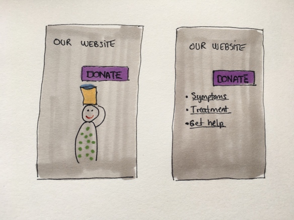
Two different types of website – one fundraising focused, one service focused

It seems obvious now that these two different pages should, and have, different conversion rates. Most people who come to the first page are there to give – most people who come to the second page are not. These are things we have to consider when we look at conversion rates. This is a huge part of why it hardly ever makes sense to compare to others than yourself.

“But I mean the *main* donate page”

Listen. The only reason you even think of a “main donate page”, is probably because it hasn’t occurred to most web designers to just put the damn form right there on the home page yet. This is what happens when everyone just follows everyone else’s lead. “Everyone else has a donate now button in the upper right hand corner? Then so will I”.

Comparing rates here will just stymie innovation and creative thinking.

Mockup of a home page with an image of a woman carrying water, and a donation form right next to her photo on the home page.

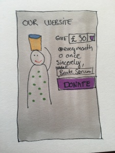
A mockup of what a page with the from right there on the home page would look like.

Plan Norway has executed some fresh thinking here beautifully, with a really user friendly and conversational sponsor-a-child form right there on the home page. As has Norwegian Church Aid, with a form in the middle of the home page that changes depending on the current need of the organisation. (You can run them both through google translate to understand them, but I recommend keeping the originals open, as GT tends to break design a lot.)

I would say it is quite likely that these pages have much lower conversion rates than a traditional stand-alone donation form page. I also say it is quite likely that they would bring in a lot more donors. And surely, that’s the more important figure?

Lower conversion rates can be a good thing

Mockup of "support us"-page, with all the ways to give stacked under each other; give monthly, give once, become a member, gift in memory, follow us, buy lottery tickets

Mockup of a standard support us-page, with all the options stacked and completion taking place on a stand-alone page

On your typical “support us” page, the standard is to just list all the different ways to give, and then lead people on to stand-alone pages for task completion. Because that is what everyone else does (again I am simplifying). When I worked at the Norwegian Cancer Society, we changed all this in our redesign, combining one-time giving and regular giving in one form, putting it at the top of the page. All the other ways of giving – in memory, becoming a member, legacies, etc – were below the form.

Mockup of support us-page with the form on top, and other options (membership, gifts in memory, follow us, buy lottery tickets) stacked underneath

Mockup of support us-page with the form on top, and other options stacked underneath

Guess what the result for conversion rates on the new page were? They went down – drastically. Because our form was now on a page with several exit points, like gifts in memory. An option that unfortunately a lot of people come for if you are a cancer charity. But guess what happened to the number of donors? The number of people signing up for monthly gifts increased nearly 10 x over three years. So again – what number should we worry about?

So, should I just never look at conversion rates then?

I’m not saying never look at conversion rates. I’m just saying don’t look for a standard where no standard could possibly exist. I’ve been known to compare conversion rates myself – but only when I know all the other factors involved so that I know I am in fact comparing apples and apples.

Your conversion rate is one of the most important numbers to know – just don’t compare it to anyone else’s unless you know they really are comparable. Look at your whole online donation journey. Identify weaknesses. Form hypothesis to improve them. Test it. Did it give you more donors / lower costs / whatever measurement you decided on in advance? Implement. Conversion rate should be one of many important KPI’s you use. It’s not the one holy grail of web metrics it is often held up to be.

Are we good? Can we stop asking what the conversion rate should be now? Thanks 🙂

Maia Kahlke Lorentzen joins b.bold!

I am so proud and happy to say that our little team now consists of three people! And what an addition the last team member is. I first met Maia Kahlke Lorentzen at the IFC some years back, where we were both speaking. We immediately clicked, and bonded over our passion for social justice causes, feminism, equality and a little good-natured bitchyness. Maia, fighting for justice

For years, we’ve been talking about doing some work together, but it never quite matched up. So you can imagine my over-the-moon joy when I learned that Maia had left her job as an engagement specialist for Greenpeace’s Save The Arctic campaign this fall. And that she wanted her next step to be joining us at b.bold.

I hope you will all join me and Seth in giving her a warm welcome to the family!

Seth and I have already had the good fortune to be working with amazing charities all over the world. With Maia on board now, we’re an even stronger team, delivering campaigns, strategies, counseling, workshops and keynotes. Before working for Greenpeace, Maia worked for Amnesty in Denmark as a digital fundraiser. She is an internationally recognized expert in digital mobilization and fundraising tactics, lead generation and integrated fundraising campaigns. She’s always on the lookout for how new technology can improve our work for a better planet. She’s been a long time fan favorite at conferences all over, and sought-after workshop facilitator known for making you think.

Like Seth and I, Maia has a burning passion for the work that is being done by the NGO-sector. We have all been on the “inside”, and we continue to feel that way – we are one of you, and that is our strongest asset. We continue to do our share for the causes we care about. Maia is a passionate human rights activist and organiser on a multitude of causes.

And, fun fact – she plays the ukulele. We’ve got the entertainment sorted for our next company outing now!

Here’s the happy (and apparently somewhat high-strung) team you call if you want to give your fundraising a boost:

bilde-30-09-2016-16-44-19

Guess what? I’m getting a colleague! :D

Words I never thought I’d be writing after just one year of operations here at b.bold. But there it is, as of Monday February 1st, there are two of us in this company. Ladies and Gentlemen: Meet Seth Piper. He will be strengthening b.bold with his knowledge in fundraising, strategy, leadership and growth.

I’m very excited and proud to have Seth join me as a fundraising consultant. His background is different from mine, and our philosophies and passion for the non profit sector are alike, and as such we make a great team.

From his name, I’m sure you can deduce that he is slightly less Norwegian of origin than I am. Originally an Englishman, he has however made Norway his new homeland, and speaks the language with more eloquence than me. Seth just came from four years as head of fundraising for Greenpeace Norway, where he basically build the organization from the ground up, increasing donations by some ridiculous percentage in the thousands. He is an initiator, who either builds something himself, or – if he takes a project over – reinvents and revitalises it.

In addition to Greenpeace, he’s worked at Médecins Sans Frontières Norway, where he picked up a flailing face-to-face project and gave it a sustained doubling in donors and income. He’s also worked at Amnesty here in Norway, plus set up a fundraising office for Amnesty in Mexico. Oh, and according to his LinkedIn profile, he has at some point met Bill Clinton. Nice!

Needless to say, he’s a great addition to the Team (which was previously just a Tim (just I, geddit 😉 ) ), and I am happy that b.bold will now be able to give a wider range of assistance to the fundraising sector in Norway and internationally. With his expertise, we’ll be able to deliver more strategic help, assistance in scaling and growth, just to mention a few.

So – watch this space, and help me make him feel welcome 🙂

(P.S: he says now that he’s in the business of helping run a business, he has to get a proper haircut. But I believe he’ll still be a radical hippie with a burning passion for especially diversity, inclusion, environmental issues, human rights issues and animal welfare.)

(P.S.2: he’s a very organized fella, so he’ll pester me to get that proper website up soon. And we will!)

Photo of Beate and Seth

Beate and Seth

How much money are you leaving on the table? A lot.

I’m probably not the only one you have ever heard say that you are leaving money on the table by not optimising your websites. But no-one has ever really said how much money. And not knowing turns this money into an abstract that we can’t really relate to, leading us to not act on it. I want to do something about that, starting by sharing some numbers.

As you may know, I started up as a consultant in September of last year. As such, I was lucky to work with a number of different Christmas appeals in 2014, and I can now compare the numbers to tell you exactly how much money you are losing out on.

A small disclaimer before I dive into the numbers; this would of course not hold up as scientific evidence – I don’t have enough data for that. But it is a very compelling example. I have anonymised the charities in mention, as it is unimportant who they are in this regard. They are aware, though. I will not be sharing all numbers to keep confidentiality. But what I do share, should be more than enough to shake you a bit. 

Two of the Christmas appeals were quite comparable, as they both had very direct asks, which led to a landing page where the actual donation would take place. As such, anyone clicking their links were full aware that they were now coming to a donation page, with not much else to do there. Their traffic sources were also very similar. Conversion rates should therefore be comparable.

One of the campaigns, let’s call it Charity A, had a landing page optimised for mobile, and where the donation forms followed best practice. The other, now Charity B, had not yet optimised their page (but were already working on it), and the page and form were not adapted for mobile.

Both campaigns were very successful. But there is a big difference in conversion rates.

Charity A – the optimised one – had a total conversion rate of more than 10% – meaning 10 % of everyone who visited ended up making a donation. And the conversion rate of mobile visitors was more than 8%.

Charity B – the non-optimised one – had a total conversion rate of about 6,5%. But here, mobile conversions were just 2,5%. Essentially, this means that a lot of the mobile visitors gave up on donating.

This is extremely important data, especially if you are using Facebook to draw traffic – a lot of the visits from Facebook are from a mobile.

So what does this mean, money-wise? Well. I compared the two conversion rates, and calculated how much more Charity B would have made with a well optimised page. I did this by taking their average donation and multiplying it with the number of donors they would have had, had they had a better conversion rate. I won’t show you the full calculation, since some of these numbers are confidential, but here are the results:

Moderate estimate (5% mobile conversion)

Charity B would have raised €16.000 / $18.000 / £12.000 more on their Christmas appeal from mobile users.

High (but realistic) estimate (8% mobile conversion)

Charity B would have raised $36.000 / $40.000 / £27.000 more on their Christmas appeal from mobile users.

Now, I would like to remind you that Charity B ran an extremely successful appeal. They raised a lot of money. And still. Look at those numbers!

Even with my own experience of how much the Norwegian Cancer Society improved their digital income after the redesign, it was a bit of a shock to see the numbers spelled out like that.

If you want to check how much you are losing out on, here’s how: 

  • Find your conversion rate from a campaign page or donation page. The number should be as close as possible to the donation moment as possible, to isolate the effect of your form / landing page.
  • Multiply your number of mobile visitors with the conversion rate you want to compare with (5% is a moderate estimate of what conversion should be). You are then left with the number of donations this conversion rate would have given you.
  • Find your average donation amount online.
  • Multiply the number of donations found in the previous step, with the average. You now have the donation amount you would have raised.
  • Subtract your actual donation amount from the number you just found. You now know exactly how much money you left on the table.

P.S.: Need help? I am happy to help you find those numbers, if you would allow me to save them for analysis and sharing (anonymously of course) with my readers later on. 

P.S 2: Done the calculations and decided you are done throwing money out the window and want to fix it? I can help. 

Money on the table

Source: TaxCredits.net

AFP Congress Toronto: Slides and resources

There’s nothing I love more than speaking to a Canadian audience! Thank you for being such a big energy boost for me. I have gathered the slides and some follow-up resources for you here. Please don’t hesitate to get in touch with me if you have any questions or thoughts – I’d love to hear them!

Do you need someone to help you with this stuff? I can help – get in touch!

Session 1, Tuesday afternoon – “From good intentions to more web donations”.

Slides

The slides have been uploaded to slideshare. Click through them here, or on slideshare.

Web form design

If you’d like to learn more about web form design, Luke Wroblewski’s book Web Form Design (2008) (http://www.lukew.com/resources/web_form_design.asp) is an excellent starting point. He also has several presentations about form design for mobile and touch.

The Cancer Society’s website and process

If you’d like to take a closer look, here’s a Google translated version of The Norwegian Cancer Society’s website or just visit kreftforeningen.no to see it in Norwegian. You can also find a lot of previous entries detailing the redesign and choices made in this blog under the tag “Redesign of the Norwegian Cancer Society web page”. Also, if you’re interested in more details on the content strategy behind the build of the page, awesome interaction designer Ida Aalen recently gave an excellent presentation at Confab Central in Minneapolis. You should absolutely check it out!

The Core Model

This presentation goes more into detail about how to use the core model with your team, which you can also hear a recording of. If you’d like to try out using the core model, you’re welcome to download the core model template forms to use in the workshops.

Even more questions?!

Awesome! I love questions:) Leave a comment below, talk to me on twitter, or ask any of these wonderful people that we’ve been happy to work with in this procject:

  • Ida Aalen, interaction designer at Netlife Research: @Idaaa
  • Marte Gråberg, web editor at the NCS: @MarteGraberg
  • Monica Solheim Slind, web master at the NCS: @SolheimSlind
  • Wilhelm Joys Andersen, front end developer: @WilhelmJA
  • Thord Veseth Foss, graphic designer: @ThordFoss
  • Eirik Hafver Rønjum, content strategist: @EirikHafver.


Session 2, Wednesday – Expect the unexpected

Slides

Slides are all uploaded to Slideshare.

Voice and tone

Have a look at voiceandtone.com – Mailchimp’s excellent guide for their writers.

Time for change – I’m setting up shop on my own!

It’s been six awesome years at the Norwegian Cancer Society. This place taught me to be a fundraiser, and it let me explore the digital arena until I became really good at it. I have had the best colleagues possible, and I owe a great deal to my amazing manager, who let me run free as much as I have. She’s an awesome fundraiser, strategist, and people person.  We’ve done some great things together at the cancer society, and I will be truly sad to leave this place. However, the time seemed right to go our semi-separate ways now. I want to have more time to do speaking and teaching, and to consult on exciting projects all over the world. I want to help make the charity sector the best at digital work! And in order to do that, I need to leave my beloved job at the cancer society.

So, starting September 1st, I will be a free agent, available for hire. I’ll work directly with charities, with agencies, with service providers and others to improve our sectors digital presence. I believe I have a skill set that is quite unique in todays market, and I can help you raise more money online, and reach more people – and do more good!

I’ll be using the summer to more clearly define what I will be helping with, and will be back with more information. Generally, it will be speaking, teaching and consulting on anything digital in the charitable sector. This includes such things as

  • Digital strategy
  • Content strategy
  • Social media
  • Donation page and form design
  • Donor experience online
  • Increasing conversions
  • Being the link between charities and providers when doing digital work – I speak both languages!

So if you have a project you’d like some help on – I’m available starting September 1st – get in touch!  

A great big thank you to all the wonderful people I’ve been lucky enough to work with over the years at the Cancer Society. You people truly are the best!

Slides and resources from IoF National Convention: “From good intentions to more web donations”

We had an awesome time speaking at IoF National Convention! Thank you for being a great and kind audience 🙂 Here are the slides and some resources from the presentation – and please, get in touch with either Ida or me if you have any questions or thoughts – we’d love to hear them!

(P.S.: Do you need someone to help you with this stuff? I can help – get in touch)

Slides

Slides can be seen and downloaded on Slideshare, or – for your merry convenience – clicked through right here!

Web form design

If you’d like to learn more about web form design, Luke Wroblewski’s book Web Form Design (2008) (http://www.lukew.com/resources/web_form_design.asp) is an excellent starting point. He also has several presentations about form design for mobile and touch.

The Cancer Society’s website and process

If you’d like to take a closer look, here’s a Google translated version of The Norwegian Cancer Society’s website or just visit kreftforeningen.no to see it in Norwegian. You can also find a lot of previous entries detailing the redesign and choices made in this blog under the tag “Redesign of the Norwegian Cancer Society web page”. Also, if you’re interested in more details on the content strategy behind the build of the page, Ida recently gave an excellent presentation at Confab Central in Minneapolis. You should absolutely check it out!

The Core Model

This presentation goes more into detail about how to use the core model with your team, which you can also hear a recording of. If you’d like to try out using the core model, you’re welcome to download the core model template forms to use in the workshops.

Even more questions?!

Awesome! We love questions:) Leave a comment below, talk to us on twitter, or ask any of these wonderful people that we’ve been happy to work with in this procject:

Tweets from the session

https://twitter.com/Swaley/statuses/486434122383233024

https://twitter.com/alexlily44/statuses/486451390714494976

We’ve made a storify of all the tweets from the session – have a look to see what other people said!