I never knew how big a difference tiny details in a donation form make. I thought a clean, nice form was enough. Turns out, I’m wrong. Over the past few years as I’ve had the pleasure of working with prodigy interaction designer Ida Aalen, I’ve learned a lot about basic form design. It all has in common that it makes a lot of sense once you know it. And that it makes a world of difference to the number of people who actually fill out your forms.
Here are some of the tricks I’ve learned, taken from a presentation by the aforementioned Ida. Making the forms easy to understand, is key. Now, this might be very basic for those of you who are all ready well versed in interaction design. If so, move along to something more interesting. But if you, like many charities I know, don’t have the form design expertise, and your form provider does not either – I hope this can be as educational to you as it was to me 🙂
This is what I would have thought was actually a quite good form.
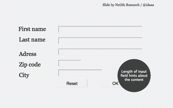
But there is a lot we can to do improve on it. For instance, I used to think that people actually read the helpful little instructions we wrote for them. But it turns out we’re all lazy bastards and we can’t be bothered. Instead, we use visual clues to tell us what should be where in a form. And so adjusting the length of each individual input field to fit with the information that should go in it, really helps our eyes and brain easily figure out what to do. So:
1. Use input field lengths to hint about what should be filled in
Here, the shorter length of “zip code” tells your brain that this is where the short (usually) number-based zip code goes.
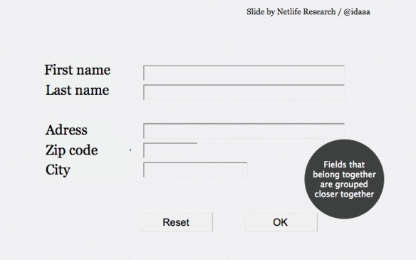
2. Fields that go together should be grouped together
The second trick to letting your brain more easily “see” what information goes where without actually reading it, is to group fields that go together. First name and last name are information that goes together. All aspects of your adress likewise. Electronic contacts like mobile numbers and e-mail go together. So:
Already, this form is putting much less cognitive strain on your brain while you’re filling it out. But let’s take out the big guns.
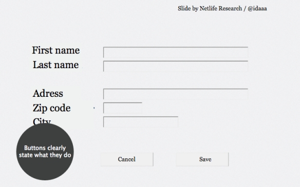
3. Buttons must clearly state what they do
This may seem obvious, but your buttons need to clearly state what they do! This should be such a no-brainer, but still we see forms using buttons that say “ok”, “send”, etc. The actions probably seem so self-explanatory to you the owner, that you don’t think that anyone else could misunderstand them. Usually, they can.
It could be a good idea to bring an outsider in and ask them what they think the buttons do. The answer might surprise you. Particularly if you bring in an outsider that is less than used to sitting in front of a computer.
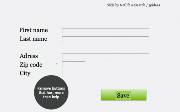
4. Remove buttons that hurt more than they help
So, who amongst you has a “reset”, “cancel” or “clear form”-button on your donation form? If you do, don’t put your hand up, because SHAME ON YOU! Why would you want to HELP someone stop the donation they’re about to give you? And really, chances are most people who click that button anyway didn’t mean to, and then has to go through the action of filling out your form all over again. If for some reason you DO insist on having a cancel button anyway, at least make it much less prominent, and place it to the left – people are used to the right button being the “move along”-button.
The grim example below is from a hotel I stayed at. Their log-on screen for the wifi had several steps. All of them had “cancel”-buttons – even steps that had no chance of incurring any fee on me. Both buttons were the same color. To make matters worse, they had reversed the positions of the “connect” and “cancel”-buttons from the normal. Usually “cancel” is placed left, and “go” right. I clicked the cancel-button SO many times erroneously, everytime I tried to log on. My brain never learned. To make matters EVEN worse, the page was not mobile friendly, so when I logged on from my phone, the only button I could see in the screen frame was the “cancel”-button. Which, of course, I clicked erroneously even more times. Gaah!
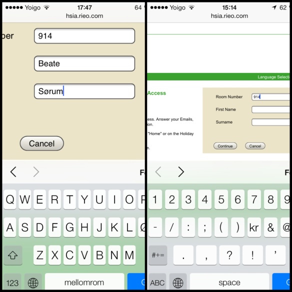
Picture to the left is how the screen looked after the page zoomes in when you tap a typing box. you had to manually zoom back out in order to get the “connect” button in the frame at all, as in the picture to the right.
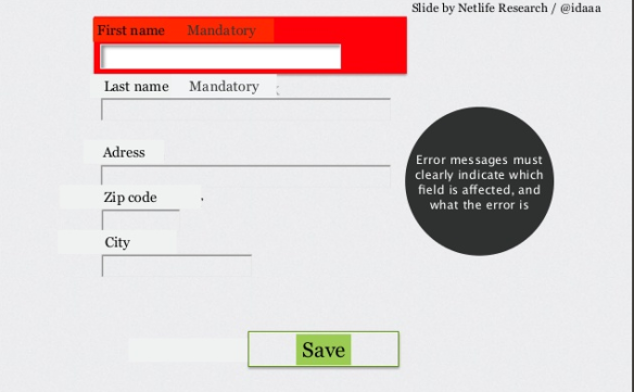
5. Error messages that actually help
How often have you clicked a “submit”-button and then having nothing happen, and not understandig why? After meticulous scrutiny you might find a tiny asterisk indicating that you filled something out wrong. But it migh still not tell you WHAT you did wrong, or how to fix it. Your error messages should be clearly visible, communicate what’s wrong and how to fix it, and be placed with the field that contains the error. Your screen should automatically move to put the error in the users view.
And that’s it – a much, much improved form through seemingly small changes.
There you have it – these are some of the key elements to improving your online donation forms – explained by me, masterly taught by Ida Aalen of Netlife Research, the “coolest UI/UX consultants in Norway”. If you want to learn more about form design, Ida highly recommends you check out Luke Wroblewski’s book “Web Form Design” and presentations.
Any other thoughts? Please share in the comments 🙂
(P.S.: Don’t forget to register for the webinar Ida and me will be holding November 27th, talking through the redesign of the cancer society web site. You can read all about it and register at Gerry McGovern’s blog.)


Pingback: How much money are you leaving on the table? A lot. | Beate thinks out loud
Pingback: Fundraising Friday | January 29, 2016 | Pamela Grow
Pingback: We all want to be understood ⋆ Hands-On Fundraising